This content was reviewed and updated in August 2026 to ensure all information remains accurate and up to date.
Twenty-six tools, sorted by the one thing that actually separates them: whether the chart keeps itself current. The table below marks which sync with your HR system and which need somebody to redraw them.
What Is the Best Org Chart Software in 2026?
Organizational chart software turns a company’s structure into a visual map of reporting lines, roles, departments, and often locations or skills. The modern platforms connect to an HRIS, so charts rebuild themselves whenever somebody joins, moves, or leaves. That single capability separates a living structure from a diagram that was accurate on the day it was drawn.
This matters more than it used to because of churn. Distributed teams, frequent restructures, and cross-functional work make a question as basic as who reports to whom surprisingly hard to answer from memory. A static slide answers it for about two weeks.
Charting also sits inside a much larger software category. Fortune Business Insights projects the global HR technology market will reach tens of billions of dollars by the early 2030s. That market covers the HRIS, talent and analytics systems these charts draw from. Org charts are a small window onto that data rather than a category of their own.
Buyer guides now treat real-time updates, HRIS integration, role-based access and cloud collaboration as baseline rather than premium. Those four features let HR see the structure as it stands today and model what it should look like next quarter. The deck nobody trusts can then be retired.
So which is best? Nothing wins outright, because these twenty-six tools belong to three families. Dedicated platforms sync with HR data and stay accurate on their own. HR suites generate a chart from records you already keep, at no extra cost. Diagramming tools give you complete visual control and no automation whatsoever. The best org chart software for HR teams is usually the one already inside the system holding their employee data.

INSIGHT: Why do most company org charts go out of date?

The problem is the updating: a chart built by hand is stale the moment somebody joins, moves, or leaves.
- Fortune Business Insights projects the global HR technology market, the systems these charts pull their data from, will reach tens of billions of dollars by the early 2030s, which tells you how much employee data now sits in software rather than spreadsheets.
- What HRIS sync changes in practice is who does the work. The chart regenerates from the employee record instead of waiting for someone to remember to redraw it, so accuracy no longer depends on one person’s diligence.
How the 26 Tools Compare
One screen, twenty-six tools. Read the data sync column first, because it is the real dividing line. HRIS sync means the chart maintains itself, import only means you refresh it, and manual means somebody redraws it. Anyone hunting for the best tool for building interactive org charts should filter on that column before anything else.
| Tool | Type | Data sync | Best for | Rating |
|---|---|---|---|---|
| BambooHR | HR suite with org chart | HRIS sync | Teams already on BambooHR | 4.4 (6,294) |
| Brex | Adjacent finance tool | Manual | Budget ownership by department | N/A* |
| Canva | Diagramming tool | Manual | Polished one-off visuals | N/A* |
| ChartHop | Dedicated org chart platform | HRIS sync | People analytics and planning | 4.3 (171) |
| ClickUp | Work management platform | Manual | Teams already running ClickUp | 4.6 (13,773) |
| Connecteam | HR suite with org chart | HRIS sync | Deskless and frontline teams | 4.6 (3,505) |
| Creately | Diagramming tool | Import only | Structure plus process mapping | 4.4 (1,394) |
| EdrawMax | Diagramming tool | Import only | Precise layout control | N/A* |
| Freshworks | HR suite with org chart | HRIS sync | Existing Freshteam customers | 4.4 (286) |
| Functionly | Org design and planning tool | Import only | Restructures and role design | 4.9 (24) |
| Gliffy | Diagramming tool | Manual | Charts inside Confluence | 4.4 (222) |
| Ingentis org.manager | Dedicated org chart platform | HRIS sync | Enterprises with complex structures | N/A* |
| Lucidchart | Diagramming tool | Import only | Cross-functional visual work | 4.5 (8,829) |
| Microsoft Visio | Diagramming tool | Import only | Microsoft-standardized companies | N/A* |
| Miro | Whiteboard and workshop tool | Manual | Live planning sessions | 4.6 (13,525) |
| Monday.com | Work management platform | Manual | Structure linked to projects | 4.7 (17,160) |
| Organimi | Dedicated org chart platform | Import only | Fast, photo-rich charts | 4.5 (156) |
| OrgChart | Dedicated org chart platform | HRIS sync | Workforce planning teams | 4.5 (297) |
| OrgPlus RealTime | Dedicated org chart platform | HRIS sync | Detailed enterprise charting | N/A* |
| Personio | HR suite with org chart | HRIS sync | European SMEs | 4.4 (917) |
| Pingboard by Workleap | Dedicated org chart platform | HRIS sync | Directory-led hybrid teams | N/A* |
| Rippling | HR suite with org chart | HRIS sync | Combined HR and IT | 4.8 (13,268) |
| Sift | Dedicated org chart platform | HRIS sync | Searchable people discovery | N/A* |
| SmartDraw | Diagramming tool | Import only | Formal corporate diagrams | 4.5 (399) |
| Smartsheet | Work management platform | Import only | Headcount and project planning | 4.4 (22,728) |
| Zoho People | HR suite with org chart | HRIS sync | Teams inside the Zoho suite | 4.4 (425) |
*Ratings are G2 scores as of August 2026; the bracketed number is how many reviews sit behind each one.
Quick Picks by Use Case
Too much table? Skip to whichever line below matches the problem you are trying to solve. Within a line, names run A to Z and imply no ranking.
- Dedicated charts that stay current on their own: ChartHop, Organimi, OrgChart, Pingboard by Workleap
- The chart you already own inside your HRIS: BambooHR, Personio, Rippling, Zoho People
- Org design and restructuring work: Functionly, Ingentis org.manager, Smartsheet
- One-off visuals for slides and board decks: Canva, EdrawMax, Microsoft Visio, SmartDraw
- Live workshops and planning sessions: Creately, Miro
- Matrix structures, where the best org chart software for large companies is dedicated: Ingentis org.manager, OrgChart, OrgPlus RealTime, Sift
INSIGHT: Dedicated platform, HR suite, or diagramming tool?
The 26 tools here belong to three different families, and the right one depends on whether the chart has to stay current on its own.
- Dedicated charting platforms, for example ChartHop, Organimi, OrgChart, Pingboard and Sift: built to sync with HR data and stay accurate without manual work.
- HR suites with a chart view, for example BambooHR, Personio, Rippling and Zoho People: the chart is generated from records you already maintain, at no extra tool cost.
- Diagramming and whiteboard tools, for example Canva, Lucidchart, Miro, SmartDraw and Visio: complete control over how the chart looks, and no automatic updates at all.
- Work management platforms such as ClickUp, monday.com and Smartsheet sit between the families, representing structure through boards and hierarchies rather than a purpose-built chart view.
Sources:
Org Chart Software Pricing Compared
Dedicated platforms charge per user per month and usually quote enterprise deals privately. Diagramming tools sell per seat, often cheaply. HR suites include the chart view at no extra charge, which is the cheapest option nobody counts. Several tools also offer a free plan that is genuinely usable for a small team.
I only list a figure where I read it on the vendor’s own pricing page today, which is why so many rows say Custom pricing. And where a chart comes bundled inside an HR platform you already pay for, its marginal cost is zero. Compare total spend, not line items.
| Tool | Pricing model | Free plan | Starting price |
|---|---|---|---|
| BambooHR | Included in HR suite | No | Custom pricing |
| Brex | Financial platform, not per seat | No | Custom pricing |
| Canva | Per seat subscription | Yes | Custom pricing |
| ChartHop | Per employee per month | No | Custom pricing |
| ClickUp | Per user per month | Yes, free forever | $10 per user/month |
| Connecteam | Tiered by team size | Yes, small-team plan | $29 per month, up to 30 users |
| Creately | Per user per month | Yes | Custom pricing |
| EdrawMax | Per seat license or subscription | Trial only | Custom pricing |
| Freshworks | Included in HR suite | No | Custom pricing |
| Functionly | Per user per month | Trial only | Custom pricing |
| Gliffy | Per user per month | Trial only | $2.80 per user/month |
| Ingentis org.manager | Enterprise license | No | Custom pricing |
| Lucidchart | Per user per month | Yes | Custom pricing |
| Microsoft Visio | Per user subscription or license | Trial only | Custom pricing |
| Miro | Per member per month | Yes | Custom pricing |
| Monday.com | Per seat per month | Yes | Custom pricing |
| Organimi | Per seat per month | Trial only | $13 per month |
| OrgChart | Per employee, quote-based | No | Custom pricing |
| OrgPlus RealTime | Per employee, quote-based | No | Custom pricing |
| Personio | Included in HR suite | No | Custom pricing |
| Pingboard by Workleap | Per user per month | Trial only | Custom pricing |
| Rippling | Per user per month | No | Custom pricing |
| Sift | Per employee, quote-based | No | Custom pricing |
| SmartDraw | Per user per month | Trial only | $8.95 per user/month |
| Smartsheet | Per user per month | Trial only | Custom pricing |
| Zoho People | Per user per month | Yes | Custom pricing |
As pricing is subject to change, prices are listed as of August 2026.
INSIGHT: What does org chart software actually cost?
Published pricing sits in a wide band, and in plenty of cases the chart is already included in software the company pays for.
- Free plans confirmed today at ClickUp, Connecteam, Creately, Lucidchart, Miro, monday.com and Zoho People. Canva also runs one. These cover small teams and basic charts rather than enterprise structures.
- Verified per-user rates: Gliffy from $2.80 a month, SmartDraw from $8.95 a month, ClickUp from $10 a month, and Organimi from $13 a month.
- Connecteam prices by team size rather than per head, starting at $29 a month for up to 30 users, which works out cheaper than per-seat pricing for frontline workforces.
- Quote-based only: ChartHop, Ingentis org.manager, OrgChart, OrgPlus RealTime and Sift. Every dedicated enterprise platform on this list prices per engagement rather than publishing a rate.
Sources:
How to Choose the Right Tool
Do you need a living chart or a picture? A picture for the board deck means a diagramming tool and an afternoon. A living chart means HRIS sync, and that narrows twenty-six down to about ten before you compare a single feature.
If sync is what you need, ask how often it actually runs. Nightly is standard, real-time is rarer than the marketing suggests, and a weekly refresh is not a living chart. Ask which fields come across too, because a chart without job titles or locations solves half the problem.
Check permissions before you buy. Employees, managers, and HR should each see different things. Salary or performance data in a chart everyone can open is a genuine incident, not a configuration quirk. Any tool sitting on top of cloud HR platforms inherits the access model those systems enforce. That is usually an argument for keeping the chart there.
Ask about dotted lines and matrix reporting. Plenty of tools draw a clean hierarchy and fall apart when someone reports to two people, which describes many modern companies. The stronger org design tools handle multiple reporting relationships as a first-class concept rather than a workaround.
Think about where the chart sits in your planning stack. Structure, headcount budget, and goals are the same conversation held three times. Pairing your chart with headcount planning tools is how most teams stop reconciling three versions of the truth.
The same logic applies to what the structure is meant to deliver. Once reporting lines are settled, the next question is what each team is accountable for, which is where goal and OKR platforms take over. Keep them separate purchases, but check they can read the same org data.
Two smaller checks are worth making. Export and print quality matters if charts end up in board packs. A 400-person chart that renders as unreadable mush is a real failure mode. New hires are also the heaviest users of any org chart, so if orientation is the driver, look at your onboarding workflow, too.
Finally, AI. Several platforms now generate charts from a spreadsheet, suggest restructures, and flag spans of control that look wrong. The best AI tool for org charts here is whichever one already holds your employee data, since that is what the models need. Treat these features as useful assistance rather than a reason to switch vendors. Charts built on people analytics data give those models something worth analyzing.
26 Best Org Chart Software Tools in 2026
The list is in alphabetical order to keep things simple and neutral.
Each block follows the same shape: what the tool is, where it helps, where it does not, and who should buy it. Ratings come from G2 and pricing from the vendor, both checked in August 2026.
BambooHR
Quick Overview:
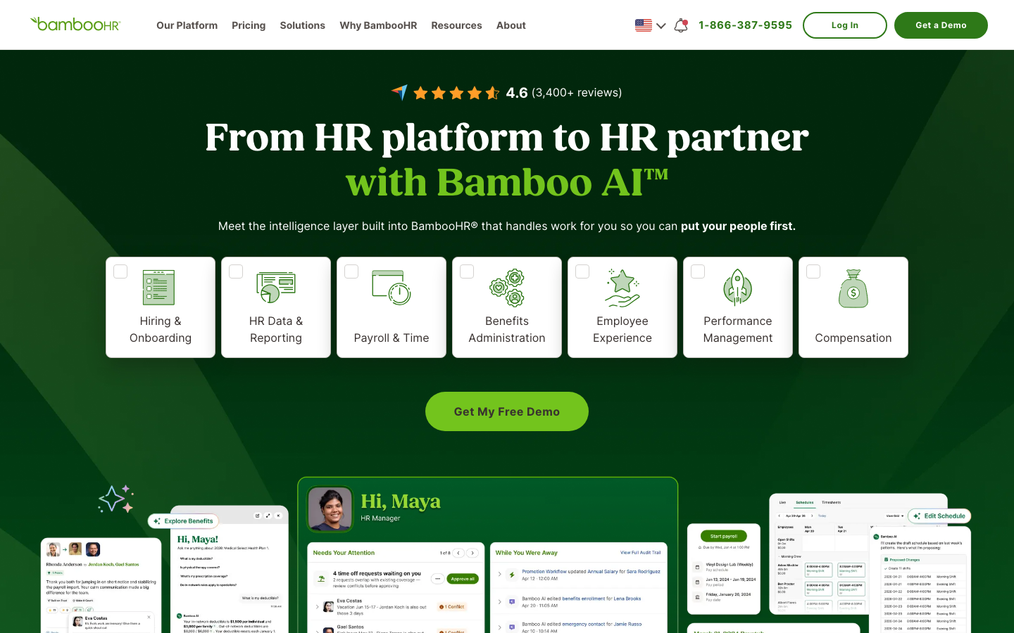
BambooHR is an HR platform for small and mid-sized companies, and its org chart is generated straight from the employee records the system already holds. Add a hire, change a manager, and the chart redraws itself without anyone opening a design tool.
Software Pros:
- The chart never drifts from the HR record, because it is the same data
- Employee profiles, photos, and contact details open directly from each node
- Self-service directory means staff answer their own who-does-what questions
Software Cons:
- The chart is a view inside the suite, not a standalone product you can buy
- Layout and styling control is limited compared with a diagramming tool
BambooHR Review:
BambooHR earns its place through arithmetic rather than features. If the HR system is already the record of truth for reporting lines, generating the chart from that record removes an entire maintenance job. G2 rates it 4.4 from 6,294 reviews, one of the largest samples in this list. The trade-off is that you get the chart BambooHR designed, with modest formatting options, so anyone hunting for the best organizational chart maker for presentation-grade visuals will want a diagramming tool alongside it.
Our Verdict
Best for small and mid-sized teams that already run BambooHR and want the chart to look after itself.
Brex
Quick Overview:
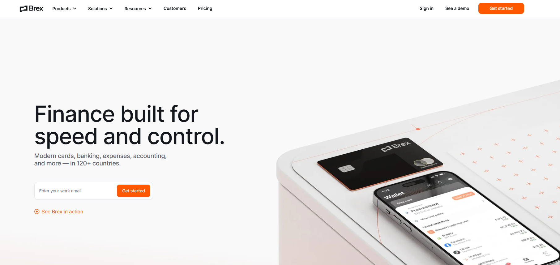
Brex is a financial technology platform built for finance teams at growth-stage companies. Where org chart tools map who reports to whom, Brex handles what comes next: who can spend what, how much, and under what conditions – before money goes out the door. It covers corporate cards, expense management, bill pay, and accounting automation on a single platform.
Software Pros:
- Pre-spend budget controls are enforced automatically at the point of purchase
- No personal guarantee is required for founders setting up financial infrastructure
- Integrates with 1,000+ ERP systems, including NetSuite, QuickBooks, and Sage
Software Cons:
- Scope goes well beyond org visualization; teams that need only a chart won’t use most of it
- Best suited to companies with active finance teams managing multi-department spend
Brex Review:
I found Brex worth including here because the gap between org structure and spending structure comes up more than this category usually acknowledges. Once you’ve mapped reporting lines and headcount in a tool like ChartHop or OrgChart, someone still has to decide who controls each department’s budget and how those limits get enforced. Brex solves that with real-time spend controls that automatically decline out-of-policy transactions, so finance teams aren’t left cleaning up after the fact. Companies like Anthropic and DoorDash use it to give department heads direct budget ownership without routing every purchase through a central approvals queue. It runs on charge cards rather than revolving credit lines, so every billing cycle closes clean.
Our Verdict
Spend Control Infrastructure for Growing Teams
Canva
Quick Overview:
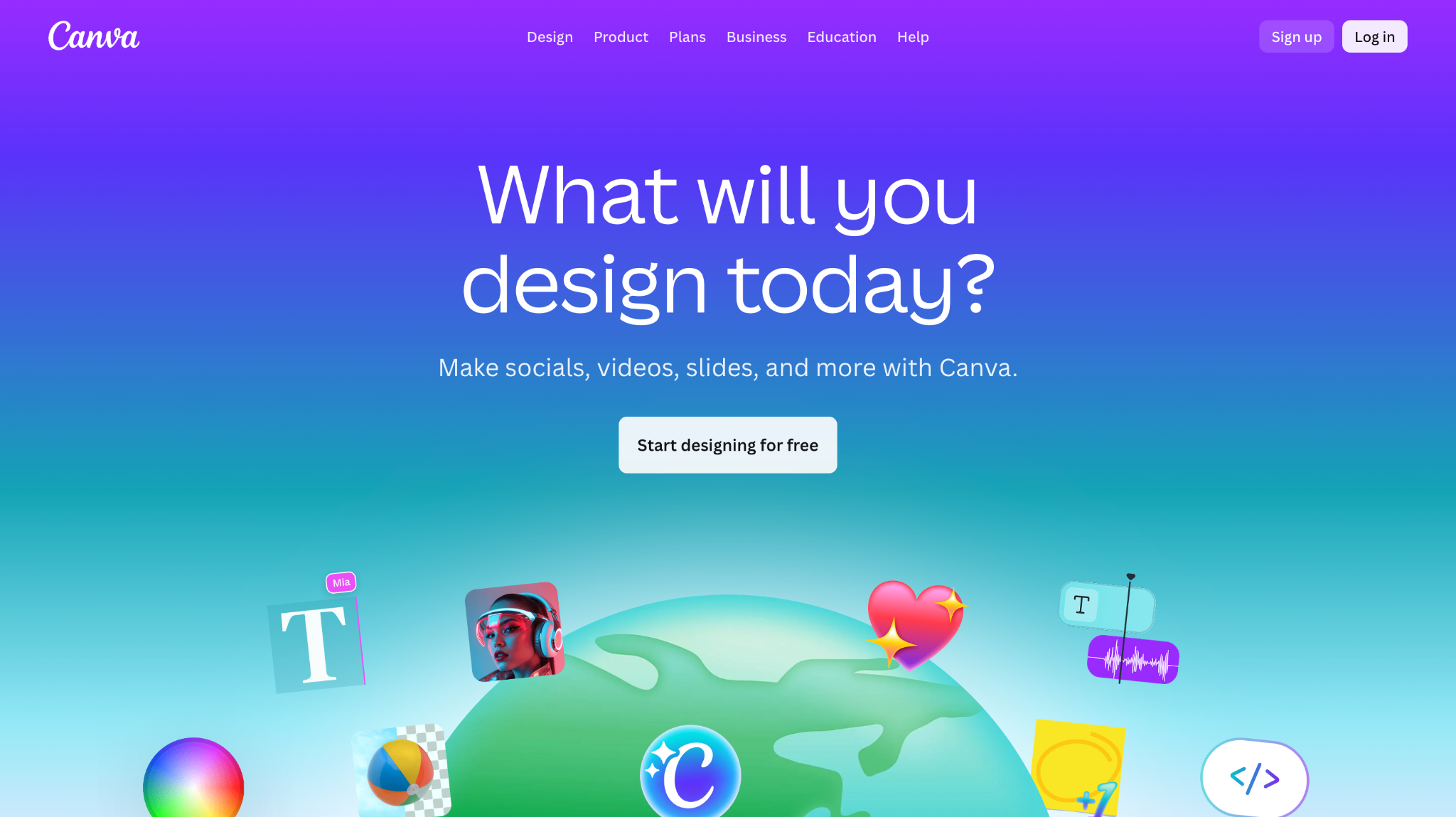
Canva is a design platform with a large template library, including org chart layouts that non-designers can fill in and publish quickly. It is drag-and-drop work with full control over color, type, and imagery, and no connection to any HR system.
Software Pros:
- Templates make a presentable chart achievable in under an hour
- Brand kits keep charts consistent with the rest of company material
- Sharing, commenting, and export to slide decks or PDF are built in
Software Cons:
- Every change is manual, so the chart is only current on the day it is made
- No reporting logic underneath, which makes large structures tedious to build
Canva Review:
Canva belongs in the diagramming family, and judged on those terms it is strong. For a board pack, an onboarding deck, or a department overview, it produces something that looks deliberate rather than improvised. For a 500-person company that reorganizes twice a year, it produces a maintenance problem. Canva has no product-specific G2 profile in this category, so no score is published here. Read it as the best program to create an org chart that has to look good once, not one that has to stay right.
Our Verdict
Best when the chart is a communication piece rather than a system of record.
ChartHop
Quick Overview:
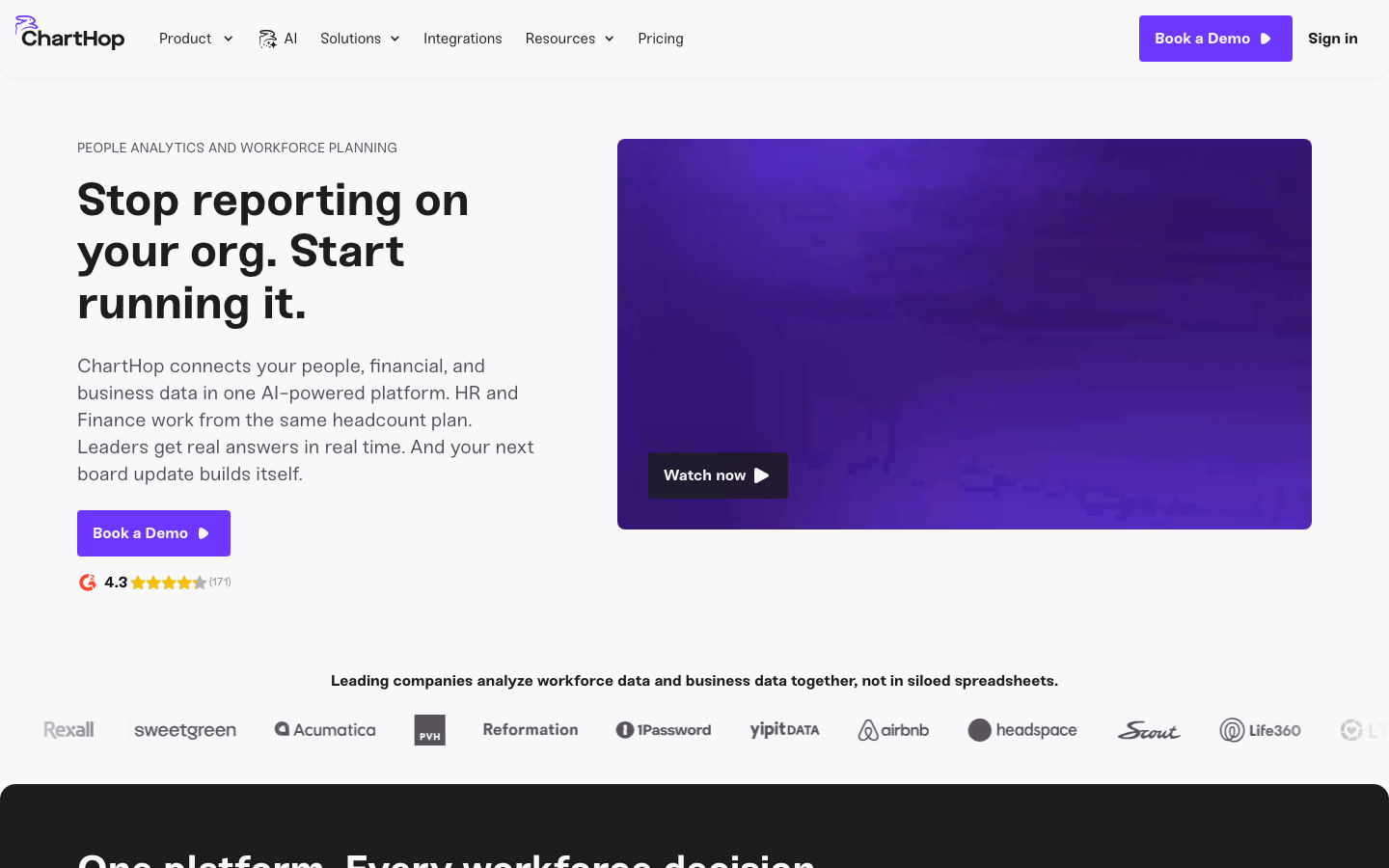
ChartHop is a people operations platform built around the chart itself. It connects to the HRIS, layers compensation and headcount data over the structure, and lets teams model reorganizations before committing.
Software Pros:
- Scenario planning shows what a restructure does before it happens
- Compensation, tenure, and performance data can be viewed on the chart
- Granular permissions keep sensitive fields visible only to the right roles
Software Cons:
- Pricing is quote-based and scales with headcount, which suits larger teams
- More platform than a company that simply wants a directory chart needs
ChartHop Review:
ChartHop is the clearest example of what dedicated org chart platforms do that a diagram cannot. Overlaying salary bands or open roles onto the structure turns the chart into a planning surface, which is why People teams tend to buy it rather than office managers. G2 puts it at 4.3 from 171 reviews. The permission model deserves attention during setup, since the same overlays that make it useful are the ones you do not want visible company-wide.
Our Verdict
Best for People teams running compensation and headcount planning off the same structure.
ClickUp
Quick Overview:
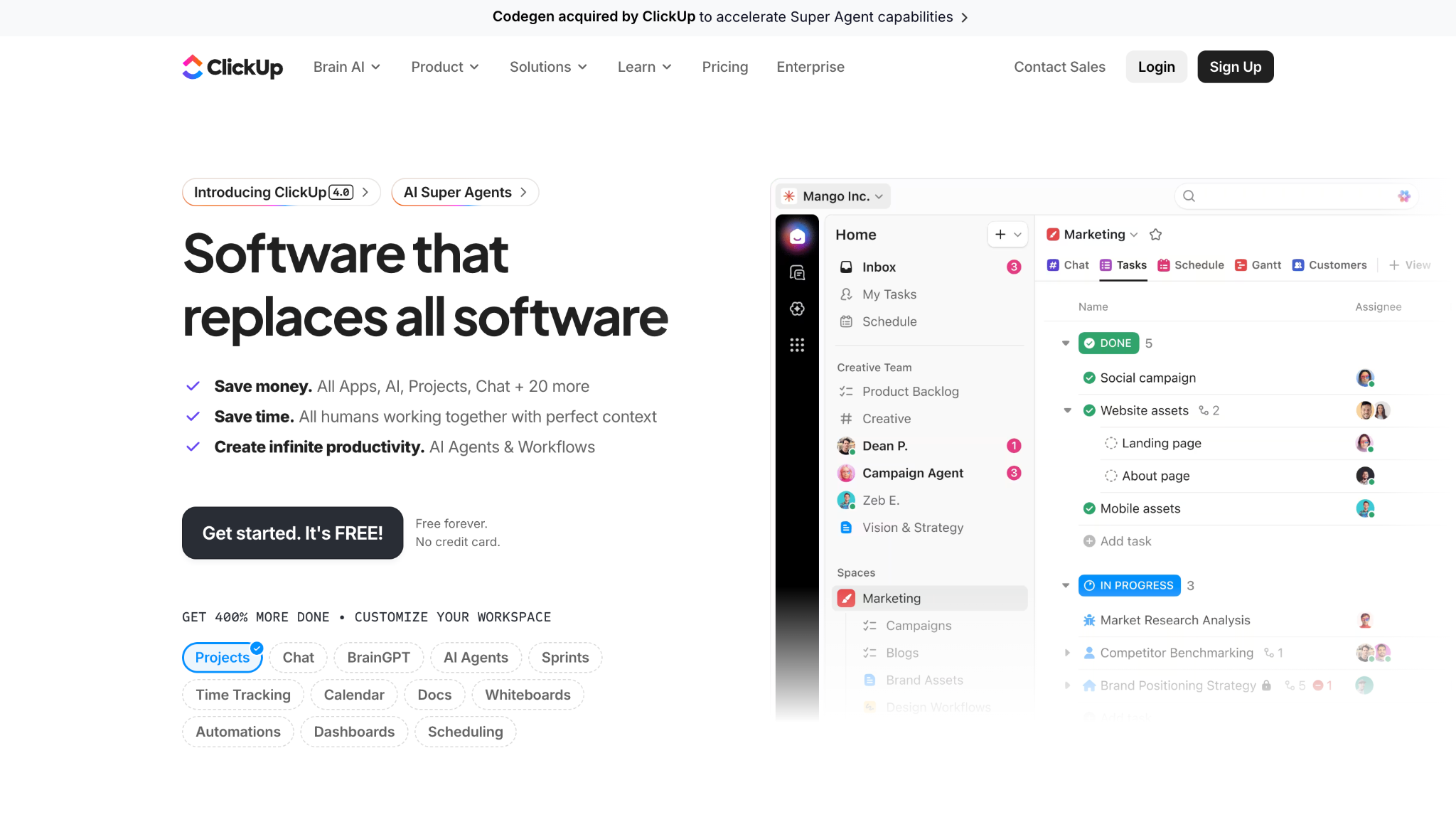
ClickUp is a work management platform covering tasks, docs, goals, and whiteboards. Org charts live on its whiteboard canvas, so they sit beside the projects the teams are working on.
Software Pros:
- A usable free plan, with paid tiers starting at $10 per user each month
- Charts sit next to tasks, docs, and goals rather than in separate software
- Whiteboard elements can link directly to the work a team owns
Software Cons:
- The chart is drawn by hand and does not update from any HR source
- The breadth of the platform is a lot to adopt for charting alone
ClickUp Review:
ClickUp is worth considering only if you already run it. Building the chart on a whiteboard next to project boards means structure and workload sit in one place, which genuinely helps during planning. It also means somebody has to redraw the chart after every change. At 4.6 from 13,773 reviews, G2 users rate the platform highly, though those reviews are about the whole product rather than its charting. As an org chart app, it is convenient rather than purpose-built.
Our Verdict
Best for ClickUp customers who want structure visible inside their existing workspace.
Connecteam
Quick Overview:
Connecteam is an all-in-one platform for deskless and frontline workforces, combining scheduling, communication, training, and HR records. Its directory and chart give shift workers a mobile view of who runs what.
Software Pros:
- Mobile-first design fits teams who never sit at a desk
- Team-size pricing from $29 a month for up to 30 users, not per seat
- A free plan covers small teams end to end
Software Cons:
- Charting is one module among many rather than the focus of the product
- Less suited to knowledge-work companies with complex matrix reporting
Connecteam Review:
Connecteam solves a version of this problem the desk-bound platforms mostly ignore. In retail, hospitality, construction and field service, the person who needs to know who their area manager is has a phone and no laptop. Pricing by team size instead of per head makes it noticeably cheaper at frontline scale. G2 rates it 4.6 from 3,505 reviews. The chart is basic by dedicated-platform standards, which is the correct design decision for the audience.
Our Verdict
Best for frontline and shift-based workforces that need structure on a phone.
Creately
Quick Overview:
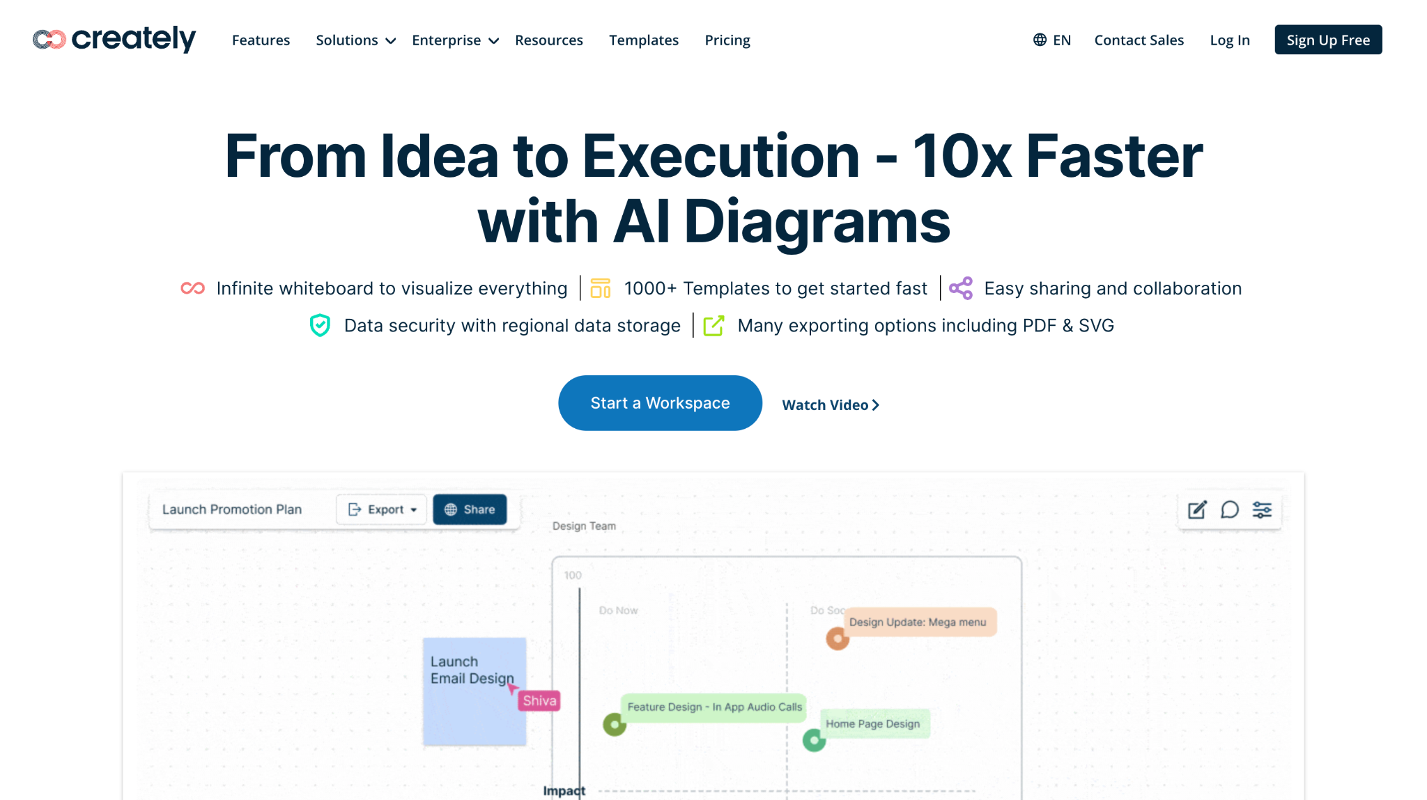
Creately is a visual collaboration workspace covering diagrams, process maps, and org charts on an infinite canvas. You can import data from a spreadsheet, and shapes carry structured fields rather than being pure drawings.
Software Pros:
- Import from spreadsheet builds a first draft without manual placement
- Each shape holds data fields, notes, and links, not just a label
- Real-time collaboration works well in live restructuring workshops
Software Cons:
- Import is a refresh you run, not a live sync with an HR system
- The breadth of diagram types makes the interface busier than a single-purpose tool
Creately Review:
Creately sits between diagramming and structured data, and that middle position is its argument. Building a chart from a CSV takes minutes, and because shapes carry fields, you can attach role definitions or notes to each node. G2 rates it 4.4 from 1,394 reviews. Among organizational chart programs, it is one of the few that treats a chart as data with a visual layer rather than a picture with labels, though you still refresh it yourself.
Our Verdict
Best for teams who map processes and structures together on one canvas.
EdrawMax
Quick Overview:
EdrawMax from Wondershare is a general-purpose diagramming application with a large template library, including org charts. It runs on desktop and in the browser, and is bought outright or by subscription rather than per seat per month.
Software Pros:
- Template range is unusually wide, covering many chart conventions
- Precise manual control over layout, spacing and connector routing
- Files export to Visio, PDF, image and Office formats
Software Cons:
- No HR integration at all, so structure changes mean redrawing
- The interface is closer to classic desktop software than a modern web app
EdrawMax Review:
EdrawMax is for people who want the chart to look exactly a certain way and are prepared to place every box themselves. The Visio-compatible export matters in companies where documents circulate in that format. G2 did not return a product-specific profile during checks, so no rating is published here rather than carrying an unverified number. Treat it as a drawing tool that includes organizational chart templates, not as a system that will keep your structure current.
Our Verdict
Best program for org charts where layout control matters more than automation.
Freshworks
Quick Overview:
Freshworks sells business software across support, IT and sales. Its HR product, Freshteam, included an org chart drawn from employee records, but Freshworks is retiring it: renewals stop from 7 March 2026, and HR workflows are moving into Freshservice.
Software Pros:
- Existing Freshteam customers keep a chart generated from HR records
- HR workflows are being absorbed into Freshservice rather than dropped
- Fits companies already standardized on the wider Freshworks suite
Software Cons:
- Freshteam is being retired, so this is not a product new buyers can start on
- Anyone renewing after March 2026 needs a migration plan first
Freshworks Review:
Freshteam’s chart worked in the conventional way, pulling from the employee record to stay accurate, and its G2 profile still shows 4.4 from 286 reviews. But a product in wind-down is not something to select in 2026. If you are on Freshteam today, use the runway to migrate; if you are shopping, the best organizational chart software for you has a future roadmap.
Our Verdict
Best treated as a migration item for current Freshteam users, not a new purchase.
Functionly
Quick Overview:
Functionly is built for org design rather than org display. It supports scenario modeling, role and accountability mapping, and side-by-side comparison of alternative structures before any are announced.
Software Pros:
- Scenario builder compares several structures against each other
- Role and accountability mapping goes deeper than reporting lines
- Import from HR data or spreadsheet to seed the current-state chart
Software Cons:
- Narrower than a general charting tool if you only need a directory view
- Small review base, so third-party evidence is thinner than for larger vendors
Functionly Review:
Functionly answers a different question from most of this list. Not who reports to whom today, but what the structure should be, and what breaks if you change it. Its accountability mapping catches work with no clear owner, which is usually the real finding in a restructure. G2 shows 4.9 from 24 reviews, an excellent score from a small sample, so weigh it accordingly. As organizational structure software for design work, it is one of the more thoughtful options here.
Our Verdict
Best for consultants and leadership teams planning a restructure rather than documenting one.
Gliffy
Quick Overview:
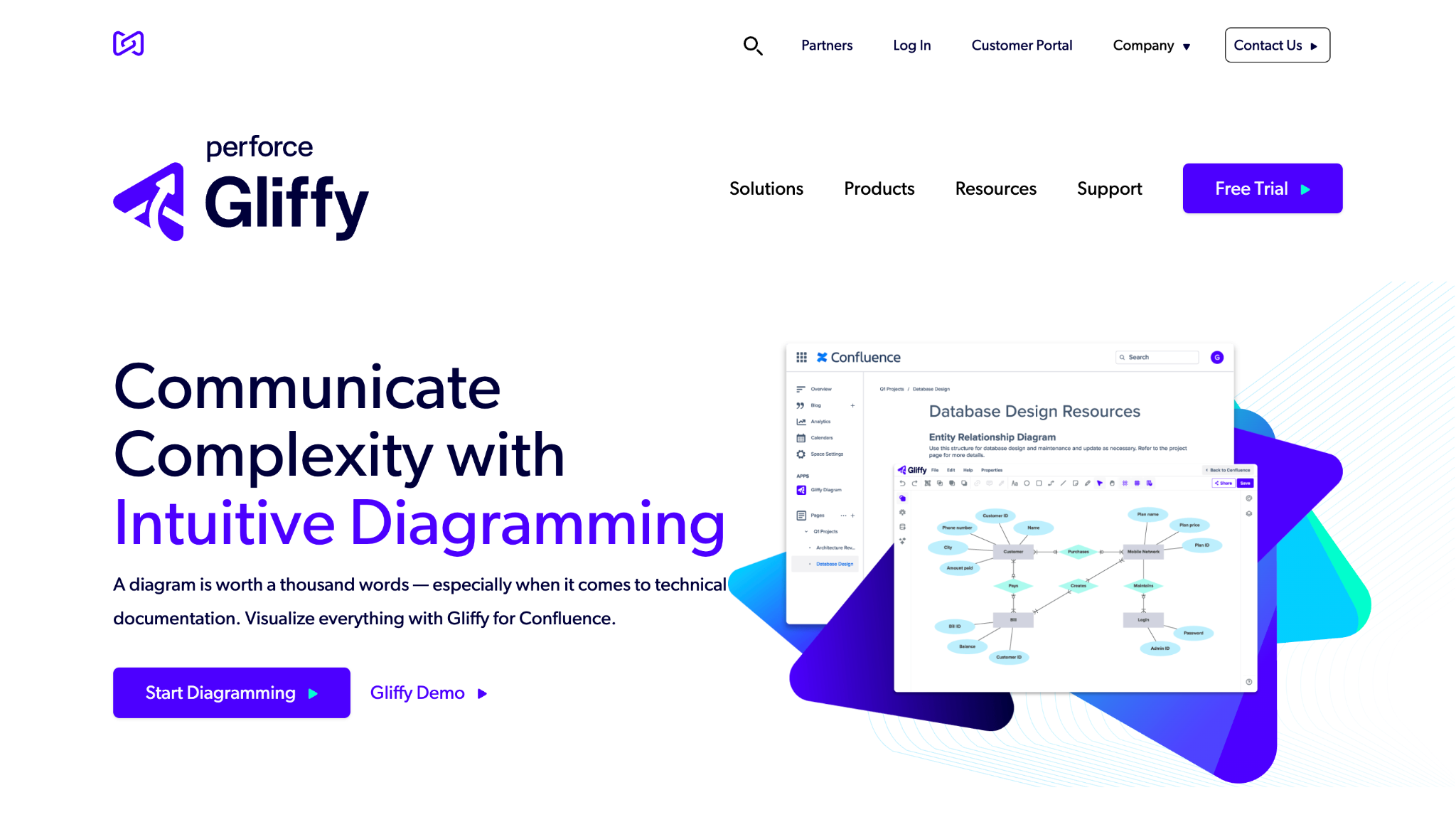
Gliffy is a diagramming tool from Perforce, best known for its Atlassian integrations. Charts are built and edited inside Confluence and Jira, which keeps them in the documentation your team already reads.
Software Pros:
- Diagrams live inside Confluence pages rather than in a separate tool
- Published pricing starts at $2.80 per user each month, among the lowest here
- Version history makes it easy to see how a structure changed over time
Software Cons:
- Charts are drawn manually with no HR data connection
- Most valuable to companies already committed to Atlassian tools
Gliffy Review:
Gliffy makes sense in one specific setup: your documentation lives in Confluence, and you want the org chart to live there too. Editing a diagram inside the page beats maintaining an image somebody exported six months ago. G2 rates it 4.4 from 222 reviews, and the entry price is the lowest published rate in this comparison. Outside Atlassian, it has less to offer than other org chart tools with broader integrations.
Our Verdict
Best for Atlassian-based teams who want charts inside their documentation.
Ingentis org.manager
Quick Overview:
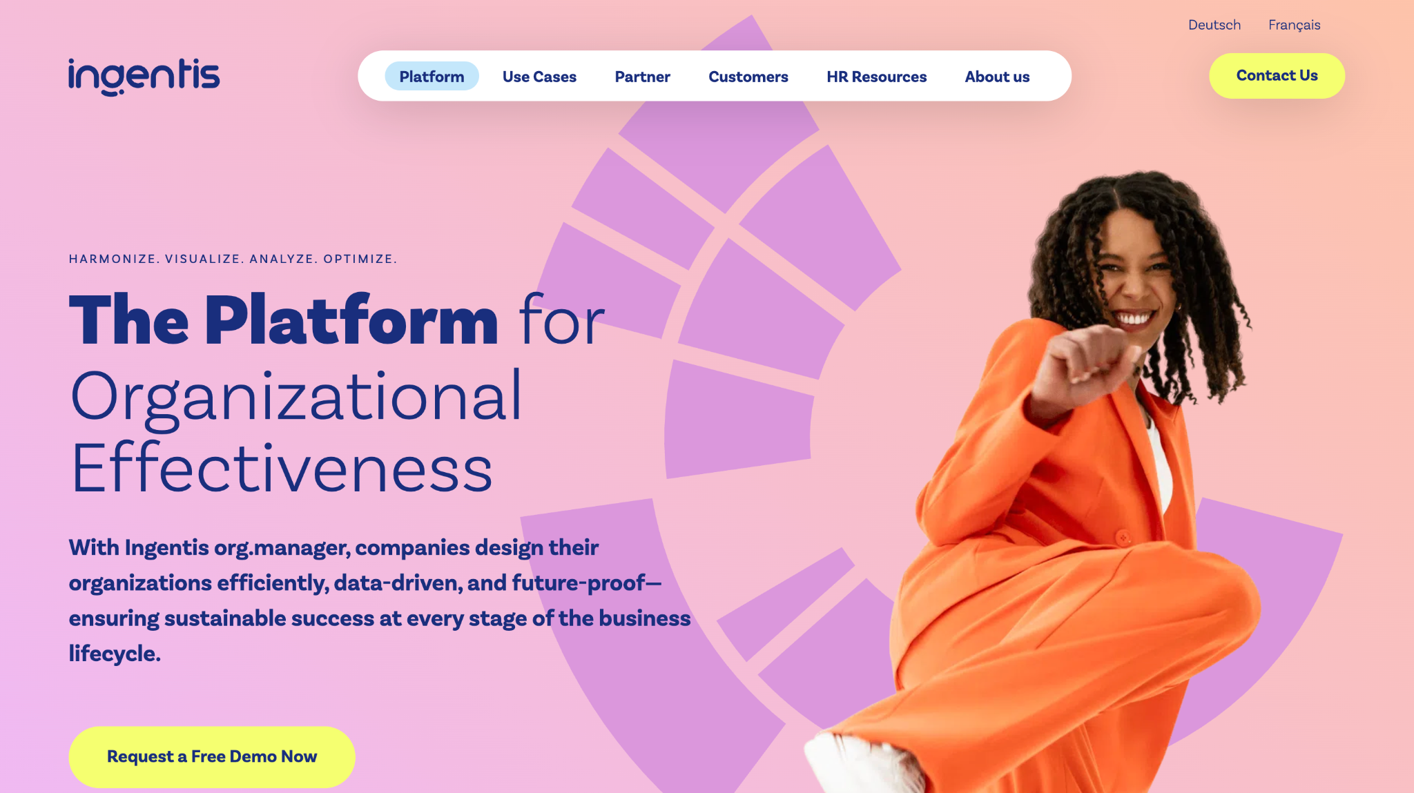
Ingentis org.manager is enterprise workforce visualization software. It reads from SAP SuccessFactors, Workday, Oracle, and similar systems, then renders large, complex structures with the analytics and formatting rules enterprises require.
Software Pros:
- Deep, supported connections to major enterprise HR systems
- Handles matrix reporting, dotted lines and multi-country structures
- Analytics and KPI overlays can be published on the chart itself
Software Cons:
- Enterprise licensing and implementation put it out of reach for small teams
- Configuration depth means setup is a project rather than an afternoon
Ingentis org.manager Review:
Ingentis is aimed squarely at organizations where a chart has to reconcile tens of thousands of records across several countries and legal entities. That is a different engineering problem from drawing 60 boxes, and it is where the general-purpose tools stop coping. No product-specific G2 profile was confirmed during checks, so no score appears here. Among org chart platforms sold to enterprises, it is an established name, and it is priced accordingly.
Our Verdict
Best for large enterprises visualizing complex structures out of SAP, Workday or Oracle.
Lucidchart
Quick Overview:
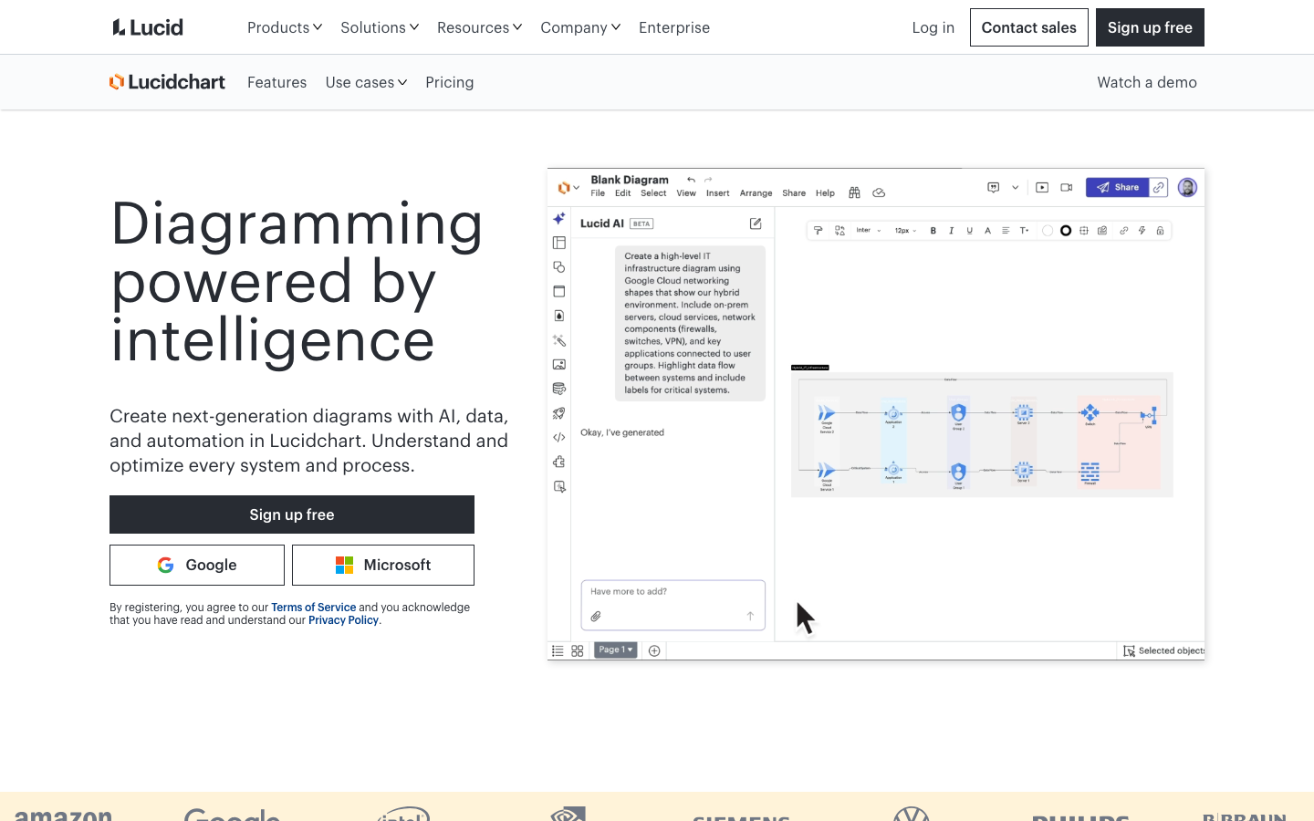
Lucidchart is a browser-based diagramming tool used widely for process maps, technical diagrams, and org charts. Its useful trick here is generating a chart automatically from imported employee data instead of drawing it.
Software Pros:
- Auto-generate a chart from a spreadsheet or HR data export
- Strong integrations with Google Workspace, Microsoft 365, Slack and Atlassian
- Conditional formatting can color nodes by department, location or level
Software Cons:
- Import is a refresh, so charts drift until somebody runs it again
- Deeper features sit on higher tiers, which raises the real cost per seat
Lucidchart Review:
Lucidchart is the diagramming tool that comes closest to behaving like a data-driven one. Point it at a clean employee export, and it builds the hierarchy for you, then conditional formatting turns the result into something you can actually read at scale. G2 shows 4.5 from 8,829 reviews under the parent Lucid Visual Collaboration Suite listing rather than a standalone Lucidchart profile. For many teams, it is the best software to create org chart views without buying a dedicated platform.
Our Verdict
Best for companies that want automated chart generation without HRIS-level pricing.
Microsoft Visio
Quick Overview:
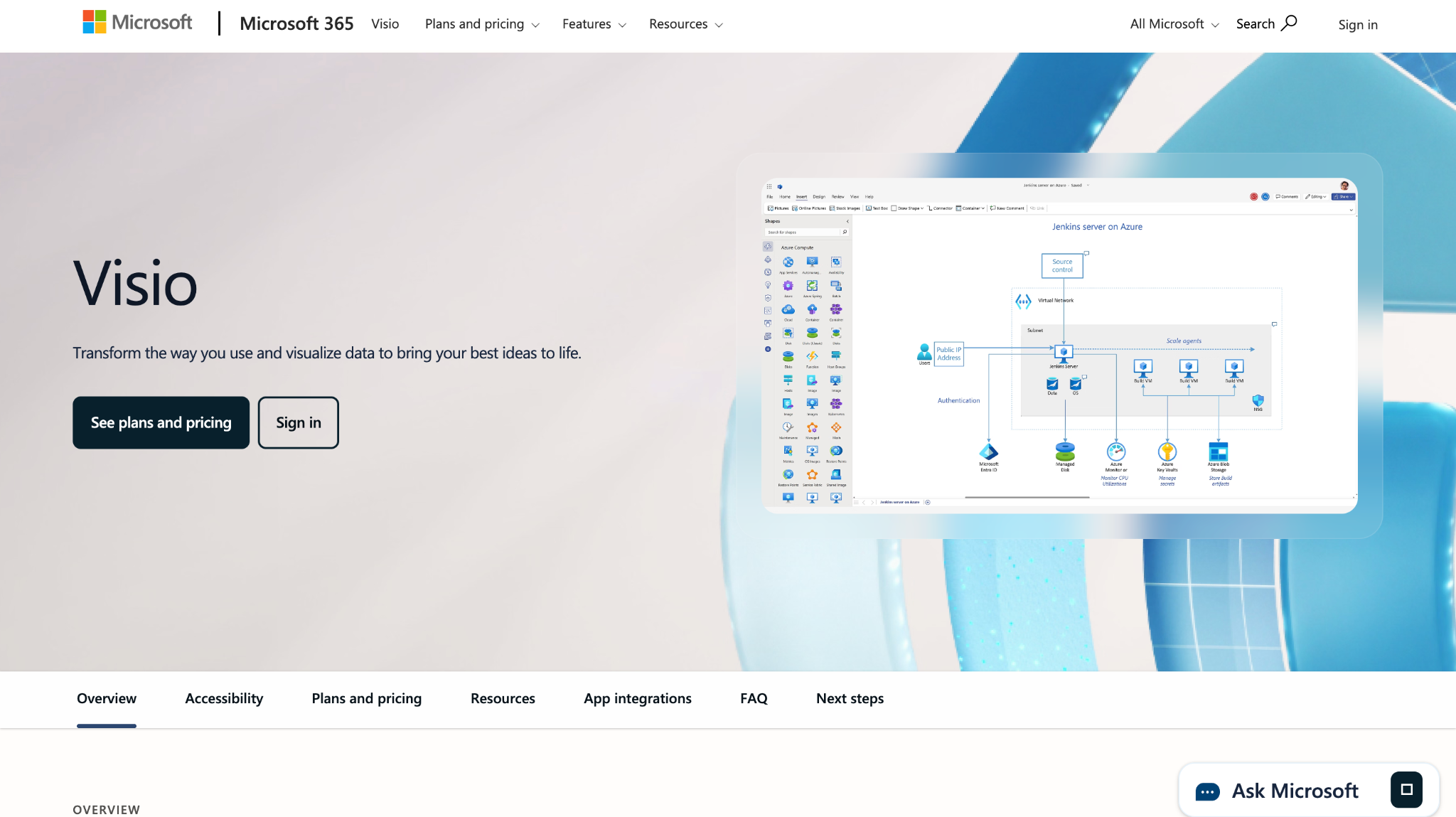
Visio is Microsoft’s long-established diagramming application, sold through Microsoft 365 or as a standalone product. Its Organization Chart Wizard builds a hierarchy from an Excel file or a directory export.
Software Pros:
- The Organization Chart Wizard generates structures from Excel or directory data
- Fits naturally into Microsoft 365 environments and document workflows
- Large shape and stencil library for formal, standardized diagrams
Software Cons:
- Licensing is separate from most Microsoft 365 plans, so it is an added cost
- The web version is more limited than the desktop application
Microsoft Visio Review:
Visio is the default in a great many corporate IT environments, and that alone settles the decision for some buyers. The wizard genuinely helps: feed it a clean spreadsheet, and the hierarchy assembles itself. What it does not do is stay current, since regenerating is a manual step. No product-specific G2 score is published here, as the profile could not be confirmed during checks. It remains a solid best app for org charts inside a Microsoft-standardized company.
Our Verdict
Best for organizations already committed to Microsoft tooling and formats.
Miro
Quick Overview:
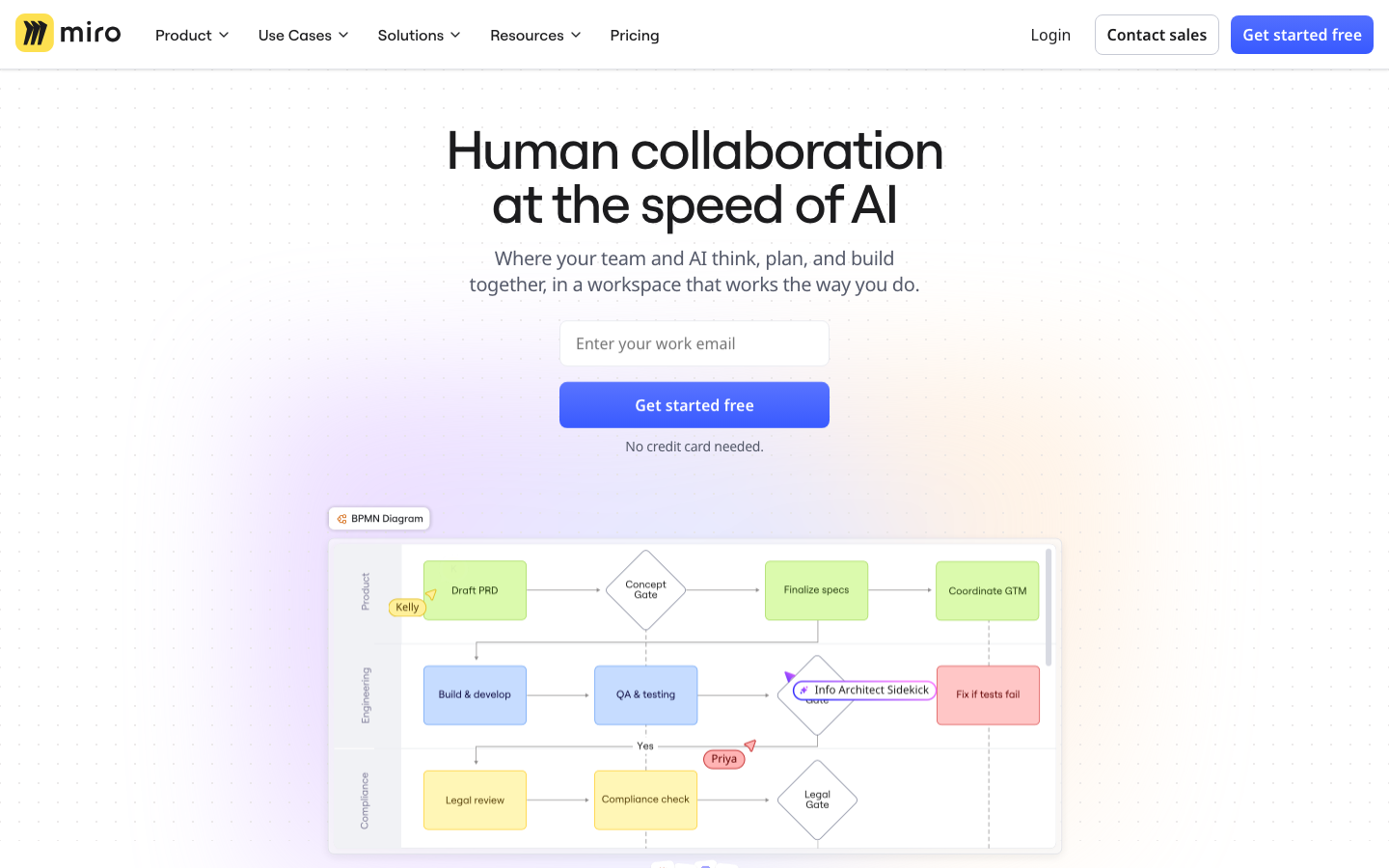
Miro is an infinite-canvas whiteboard for workshops, planning, and collaborative design. Org charts here are usually working artifacts built during a session rather than published documents.
Software Pros:
- Excellent for live restructuring workshops with a distributed group
- Templates, sticky notes, and voting support the discussion around the chart
- A free plan and broad integrations lower the barrier to trying it
Software Cons:
- Purely manual, with no employee data source behind the boxes
- Boards can sprawl, and a chart drawn in a workshop rarely gets maintained
Miro Review:
Miro is where the structure gets argued about before it gets documented. Dragging boxes around with the leadership team on a call, voting on options, leaving comments on specific roles: this is what the canvas is good at. G2 rates it 4.6 from 13,525 reviews. Once decisions are made, the outcome belongs somewhere that updates itself, so treat Miro as an organizational mapping tool for the thinking stage rather than the system of record.
Our Verdict
Best for collaborative design sessions rather than a maintained chart.
Monday.com
Quick Overview:
Monday.com is a work operating system built on customizable boards. Structure is represented through people columns, board hierarchies, and dashboards rather than a purpose-built chart view.
Software Pros:
- Highly customizable boards adapt to how a company actually works
- Structure links directly to the projects and owners it belongs to
- Automations reduce the manual upkeep of the underlying board data
Software Cons:
- No native org chart view, so the structure is represented rather than drawn
- Costs climb quickly with seat count on higher tiers
Monday.com Review:
Monday.com scores 4.7 from 17,160 G2 reviews, the highest rating in this comparison among the large-sample tools, but it is not really a charting product. What it offers is a live map of who owns what work, which for some teams answers the question better than a hierarchy diagram does. If you want an actual chart, expect to build it on a board or export the data elsewhere. Judge it on work management first and charting second.
Our Verdict
Best for existing monday.com customers who care more about ownership than hierarchy.
Organimi
Quick Overview:
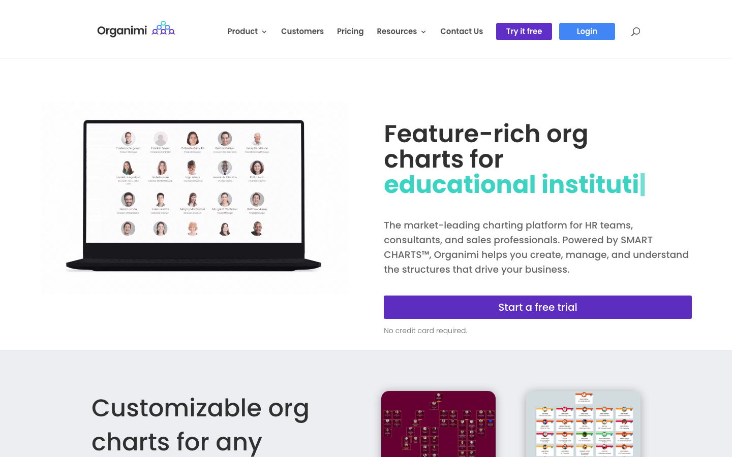
Organimi is a dedicated org chart tool built for speed. Upload a spreadsheet or connect a data source and it generates a photo-rich, searchable chart in minutes, with public sharing options for directories.
Software Pros:
- Charts build from a CSV upload faster than almost anything else here
- Photo directory view makes it useful for onboarding and internal search
- Published pricing from $13 a month, with a higher tier at $25
Software Cons:
- Import-and-refresh rather than continuous sync with an HR system
- Fewer analytics and planning features than the enterprise platforms
Organimi Review:
Organimi is the practical middle option: more capable than drawing a diagram, cheaper and far quicker to adopt than an enterprise platform. Charts look good with photos, which sounds cosmetic until new starters use it to put faces to names. G2 rates it 4.5 from 156 reviews, and it is one of the few dedicated tools publishing a real price. As a best org chart builder for small and mid-sized companies, it is hard to fault on value.
Our Verdict
Best for small and mid-sized teams that want a real chart today, not after procurement.
OrgChart
Quick Overview:
OrgChart, from OrgChart Inc, automates charting and workforce planning for mid-market and enterprise HR teams. It connects to major HR systems, refreshes on a schedule, and supports headcount modeling on top of the live structure.
Software Pros:
- Scheduled automatic refresh from the connected HR system
- Workforce planning and what-if modeling built around the current structure
- Publishing and distribution controls for sharing charts across the business
Software Cons:
- Quote-based pricing with no published rate to compare against
- Implementation and data mapping take real effort at the start
OrgChart Review:
OrgChart is what a People team buys when the chart has become an operational dependency rather than a nice-to-have. Scheduled refresh plus planning features means the same tool answers what the structure is and what it should become. G2 rates it 4.5 from 297 reviews. The setup cost is real: connecting an HRIS and mapping fields properly is a project, not a signup. Expect the value to arrive in the second month, not the first week.
Our Verdict
Best for HR teams running regular workforce planning off a live chart.
OrgPlus
Quick Overview:
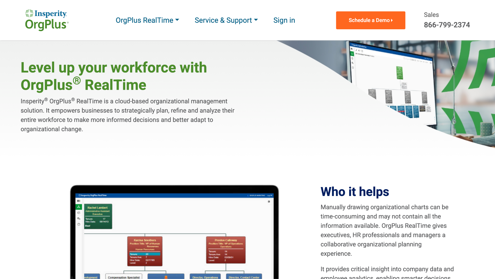
OrgPlus is Insperity’s org charting line, and OrgPlus RealTime is its cloud version. It pulls from HR data to publish charts that refresh automatically, with detailed formatting rules and controlled distribution across the business.
Software Pros:
- Automatic refresh from HR data, so published charts stay current
- Fine-grained control over layout, fields, and chart styling
- Access controls determine who sees which fields and which branches
Software Cons:
- Quote-based pricing, with no rate published on the vendor site
- The product line is long-established, and the interface shows its age in places
OrgPlus Review:
OrgPlus has been in this category for a long time, and RealTime is the cloud answer to the old desktop tool many companies still remember. Worth flagging: the previous version of this article linked to orgplus-desktop.com, which is not Insperity’s site, so the link now points at orgplus.com. If you need charts published to thousands of employees with tight control over what each audience sees, it remains a credible best org chart tool for that job. No G2 profile was confirmed during checks.
Our Verdict
Best for enterprises publishing controlled, automatically refreshed charts at scale.
Personio
Quick Overview:
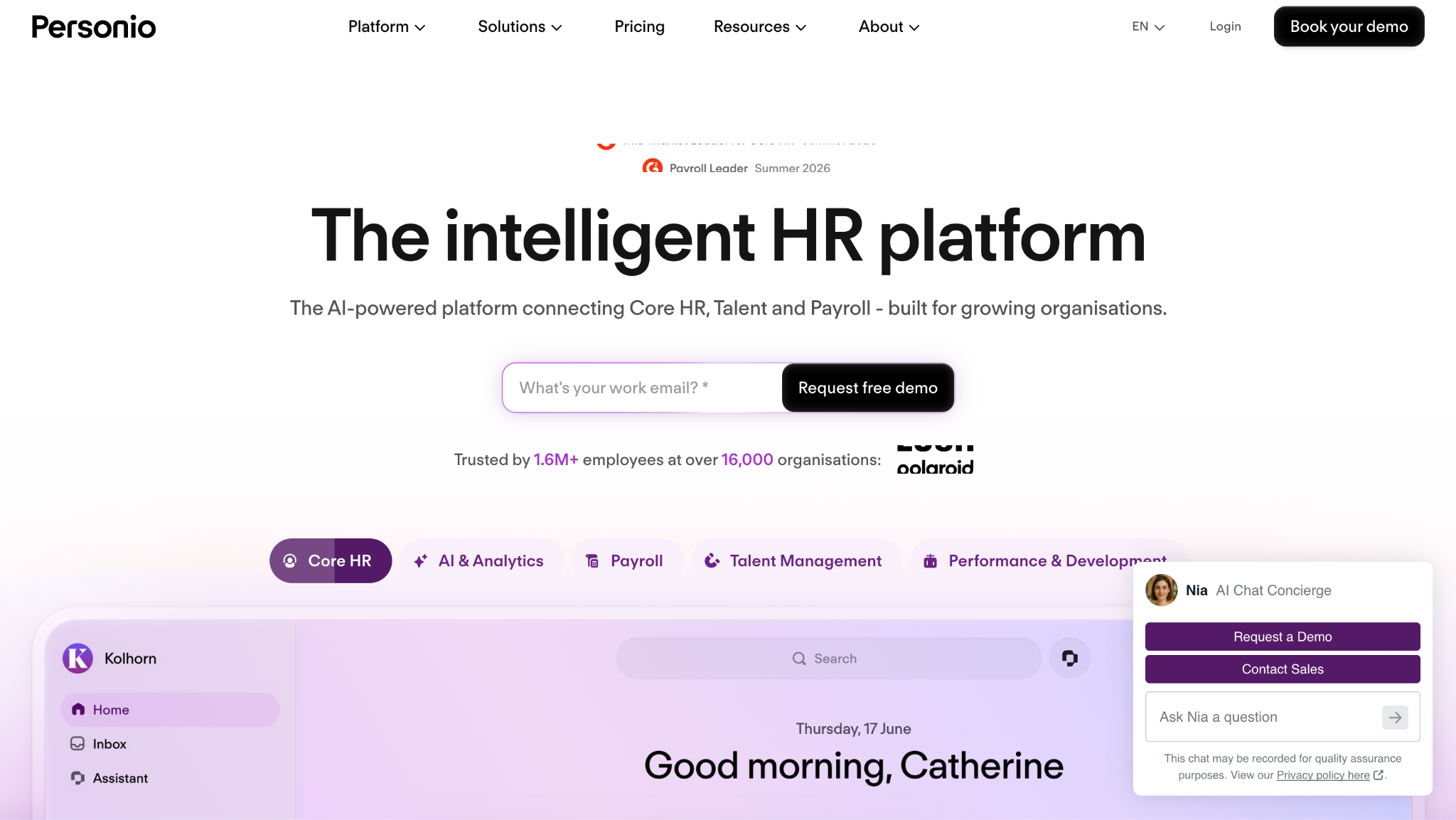
Personio is an HR platform built for European small and mid-sized companies, covering recruiting, employee records, absence and payroll preparation. Its org chart is automatically drawn from those records.
Software Pros:
- Chart updates from the employee record with no separate maintenance
- Strong fit for European compliance, contracts and absence rules
- Employee self-service reduces routine questions to the HR team
Software Cons:
- Charting is a suite feature, so it is not sold or priced on its own
- Less relevant outside Europe, where the compliance work matters less
Personio Review:
Personio’s charting argument is the same as BambooHR’s, applied to a European buyer: if the records live here, the chart should too. G2 rates it 4.4 from 917 reviews. Companies pay for compliance depth, with the chart as a by-product that happens to stay accurate. One editorial note: the internal comparison link that previously sat inside this block has been moved to the How to Choose section, where it fits the reader’s question rather than interrupting it.
Our Verdict
Best for European SMEs keeping personnel files and reporting lines together.
Pingboard by Workleap
Quick Overview:
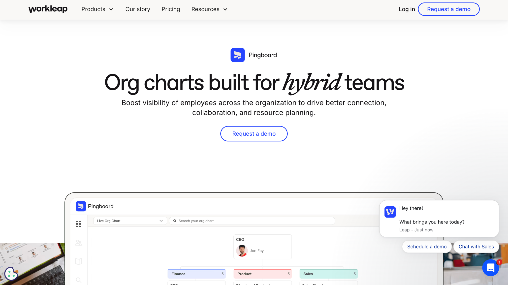
Pingboard, now part of Workleap, is an employee directory and org chart tool aimed at hybrid and distributed teams. It syncs with HR systems and adds profiles, search, and peer recognition around the structure.
Software Pros:
- Directory-first design makes people easy to find, not just to place
- Syncs with common HR systems so the hierarchy stays current
- Profiles, pronunciations and photos help distributed teams connect
Software Cons:
- Now part of a wider Workleap suite, so positioning has shifted
- Directory features matter less to a co-located company
Pingboard Review:
Pingboard is built for the situation where nobody has met in person. Searchable profiles, name pronunciation, and a current chart do more for a distributed team than a static hierarchy ever will. Since the Workleap acquisition, it sits inside a broader engagement product, which is worth checking against your needs before buying. We didn’t confirm a product-specific G2 profile during our checks, so no score is shown. Among org chart apps for hybrid teams, it remains one of the better-known choices.
Our Verdict
Best for distributed teams who need a searchable directory as much as a chart.
Rippling
Quick Overview:
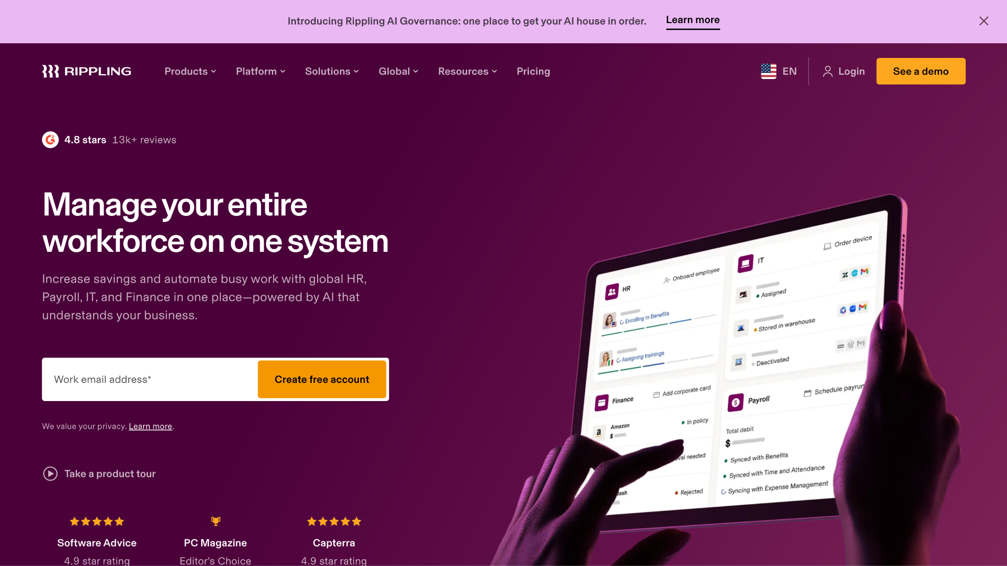
Rippling combines HR, IT and finance administration on one employee record, so a single change can update payroll, device access, app permissions and the org chart at the same time.
Software Pros:
- One employee record drives HR, IT provisioning and the chart together
- Onboarding and offboarding workflows run from the same structure
- Reporting and permissions scale well as headcount grows
Software Cons:
- No published pricing, and the modular structure makes quotes vary widely
- The chart is a small part of a large platform commitment
Rippling Review:
Rippling holds the strongest ratings-to-scale combination here, 4.8 from 13,268 G2 reviews, though those cover the whole platform rather than its charting. The genuine insight in its design is that reporting lines drive access rights: change a manager and approvals, devices, and app permissions follow. That makes the chart operational rather than decorative. Nobody should buy Rippling for a chart, but companies buying it for HR and IT get an accurate one included.
Our Verdict
Best for companies unifying HR and IT administration on one record.
Sift
Quick Overview:
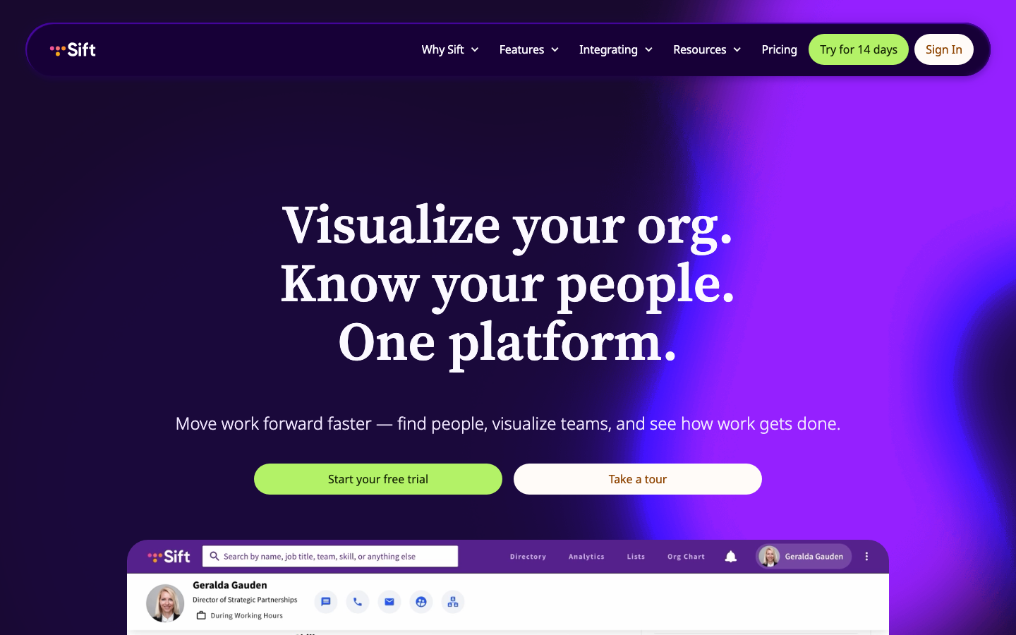
Sift is a people directory built for discovery inside large organizations. It ingests HR data and makes the structure searchable by skills, projects, and expertise rather than only by reporting line.
Software Pros:
- Search by skill or project, not just by name or department
- Automatically ingests HR data to keep profiles and structure current
- Designed for the scale where nobody knows everybody
Software Cons:
- Aimed at large organizations, so it is oversized for small teams
- Discovery focus means less emphasis on formal chart presentation
Sift Review:
Sift addresses the problem an org chart cannot: in a company of several thousand people, knowing the hierarchy does not tell you who has done this before. Making expertise searchable alongside structure is a meaningfully different product idea, and the automatic ingestion keeps it honest. No G2 profile was confirmed during checks. If your actual complaint is that people cannot find each other, this is the best org chart software for that symptom, though it is really a directory.
Our Verdict
Best for large organizations where finding expertise matters more than seeing the hierarchy.
SmartDraw
Quick Overview:
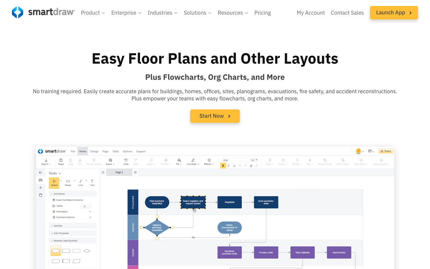
SmartDraw is a diagramming application with strong automatic layout. Feed it a data file, and it arranges the hierarchy itself, with formal styling suited to corporate and engineering documents.
Software Pros:
- Automatic layout produces tidy hierarchies without manual placement
- A published rate of $8.95 per user monthly, with no quote required
- Imports from spreadsheets and exports cleanly into Office documents
Software Cons:
- Refreshes are run by hand, so charts age between imports
- Menu-heavy design that owes more to desktop software than to the browser
SmartDraw Review:
SmartDraw’s automatic layout engine is the reason to choose it over a general design tool: it makes the arrangement decisions that make large charts readable, which is tedious work by hand. G2 rates it 4.5 from 399 reviews, and the entry price is published, which is rarer here than it should be. Among the best org chart tools for formal documents, it is a good fit when output quality matters more than live accuracy.
Our Verdict
Best for formal corporate diagrams where clean automatic layout matters.
Smartsheet
Quick Overview:
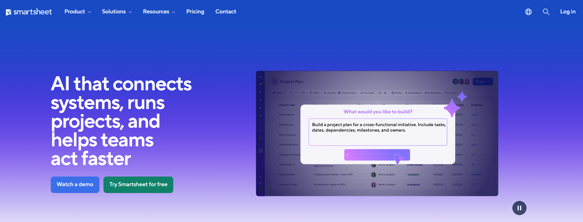
Smartsheet is a work management platform with a spreadsheet interface, used heavily for planning. Hierarchies are expressed through parent-child rows and card views, with charting handled through reports and dashboards.
Software Pros:
- Familiar grid interface lowers adoption effort for planning teams
- Handles headcount, budget and project planning against the same rows
- Automations and approvals reduce manual coordination work
Software Cons:
- No dedicated org chart view, so structure is tabular rather than visual
- Per-user pricing adds up across a large planning group
Smartsheet Review:
Smartsheet earns its place through headcount planning rather than charting. Open roles, approved budget, and hiring status live naturally in rows, and the structure falls out of the hierarchy you build. G2 rates it 4.4 from 22,728 reviews, the largest sample in this comparison. If you need a picture of the organization, you will export the data into something else. If you need to plan the organization, this is a reasonable place to do it.
Our Verdict
Best for planning teams who work in grids and need structure alongside budget.
Zoho People
Quick Overview:
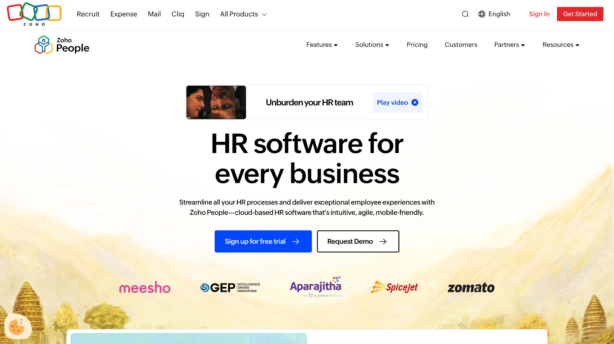
Zoho People is the HR module of the Zoho suite, covering employee records, attendance, leave, and performance. The org chart is generated from those records and inherits the suite’s permission model.
Software Pros:
- Chart generated from HR records, so it updates without manual work
- Connects to the wider Zoho suite, including CRM and Projects
- A free tier exists, which is unusual for HR platforms
Software Cons:
- Charting is basic next to dedicated platforms
- The suite works best when you adopt several Zoho products, not one
Zoho People Review:
Zoho People is the low-cost route to an automatically maintained chart, particularly for companies already using Zoho elsewhere. G2 rates it 4.4 from 425 reviews. The brief suggested a specific entry price, but the published pricing page could not confirm it during checks, so no figure appears here rather than an unverified one. Expect a functional chart rather than a planning surface, which for many small companies is exactly what the best organization chart software has to do.
Our Verdict
Best for small companies already inside the Zoho ecosystem.
FAQs About Organization Chart Software
Which capabilities decide the choice of a charting tool?
Start with whether the chart has to stay current on its own. If it does, the shortlist is limited to tools that connect to your HR system, and everything else is a drawing exercise. After that, check permissions, because charts often carry more information than everyone should see. Then look at whether the tool handles dual reporting and how well large structures print. Last, check whether the price is per employee or per editor. Those answers decide it.
Can these tools show more than reporting lines?
Many can. Dedicated platforms overlay compensation bands, tenure, location, performance ratings, open roles, and cost per team onto the same structure. That turns a diagram into a planning view. It is also the main reason to set permissions carefully before rollout. HR suites usually show a lighter set: photo, title, department, contact details. Diagramming tools show whatever you type into the box, and nothing changes unless you change it.
How often do charts need updating?
In a growing company, weekly is not an exaggeration. Every hire, exit, promotion, transfer, and manager change alters the picture, and a 200-person company with normal turnover sees several of those a month. That is why the sync question dominates this category: a manually maintained chart is accurate for a few days after somebody remembers to open it. Tools connected to the HR record typically refresh nightly, which is close enough to live for practical purposes.
Do small companies actually need a dedicated tool?
Under about 50 people, usually not. A slide or a shared design file works, because everyone knows everyone and the structure changes slowly. The tipping point arrives somewhere between 50 and 150 employees. New starters can no longer name the leadership team, and managers start asking who owns what. If your HR platform already generates a chart, use that first. Buying something separate makes sense once planning, not orientation, is the driver.
What happens to the chart when the company restructures?
This is where the tool choice shows. A connected platform updates as soon as the HR records change. Better ones let you model the new structure privately, compare it against today, then publish it when the announcement goes out. A drawn chart has to be rebuilt, usually in a hurry, usually by whoever made the last one. Restructures also bring dual reporting, so check that the tool can draw a dotted line before you need one.
Is employee data in these systems secure?
The established vendors run the expected controls: encryption in transit and at rest, single sign-on, role-based access and audit logging. SOC 2 reports are available on request. The practical risk is rarely the vendor but the configuration. Think of a chart shared by public link, or salary fields visible to everyone because nobody reviewed the defaults. Decide who sees which fields during setup, not after somebody notices.
Can a chart be built from a spreadsheet?
Yes, and it is the most common starting point. Most tools accept a CSV with employee name, title, department, and manager. Then generate the hierarchy automatically from the manager column. Duplicate names, vacant manager fields, and people reporting to two managers all break the build. Clean the file first, and a 500-person chart assembles in minutes.
How do these tools handle dotted-line and matrix reporting?
Unevenly, and it is worth testing before you buy. Enterprise platforms treat secondary reporting as a real relationship, with its own line style and its own rules for who appears where. Mid-market tools often allow one extra relationship per person and stop there. Diagramming tools let you draw any line you like, since nothing underneath is checking. If matrix management describes how your company runs, make this the first question on the demo call.
Are free options good enough for a small team?
For a team under 30 people with a simple hierarchy, often yes. Free tiers from ClickUp, Connecteam, Creately, Lucidchart, Miro, monday.com and Zoho People all produce a workable chart, and Canva runs a free plan too. The limits show up as caps on editors, boards, or employee records, and none of the free tiers includes HR system sync. Treat a free plan as the right answer while the structure is small enough to hold in your head.

Yaryna is our lead writer with over 8 years of experience in crafting clear, compelling, and insightful content. Specializing in global employment and EOR solutions, she simplifies complex concepts to help businesses expand their remote teams with confidence. With a strong background working alongside diverse product and software teams, Yaryna brings a tech-savvy perspective to her writing, delivering both in-depth analysis and valuable insights.